
HEINEKEN
HEINEKEN
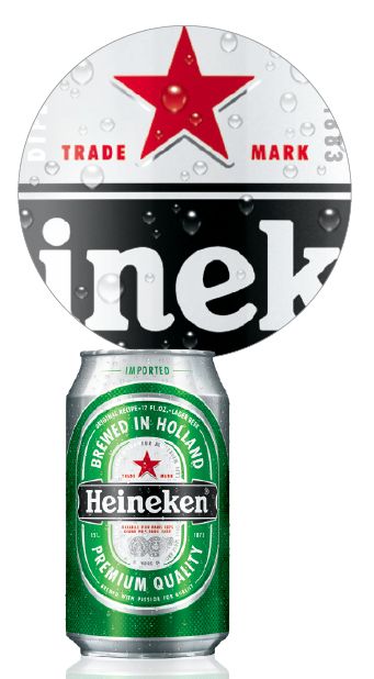
Heineken has redesigned its can packaging – incorporating four distinct elements: the brand’s iconic racetrack label is prominently featured on the front of the can while on the back, the contemporary vertical logo is the focus; the new aluminum can offers a more sophisticated appearance; the curve of the can gives the pack a more fluid and dynamic look and finally; the innovative raised ink printing technology adds a unique texture to the can, creating the visual impression of condensation on the outside while providing a tactile experience to the consumer. The new can package is currently available in 12- and 16-ounce sizes. This summer a 24-ounce can will be released. A new 3×4 suitcase format replaces the 2×6 fridge pack and makes it easier to stack and display. Heineken will support the national launch with advertising including print and 3O second digital executions. Additionally, merchandising and POS including can dispenser units, price cards, cooler decals, door handles, tuck cards, and case stackers will be available. The support materials will feature a special printing technique that creates a 3-D look and communicates the “Feel the New Can. Taste the Exceptional Quality” brand message. Available from Atlas Distributing, Horizon Beverage Company, Commercial Distributing and Merrimack Valley Distributing.